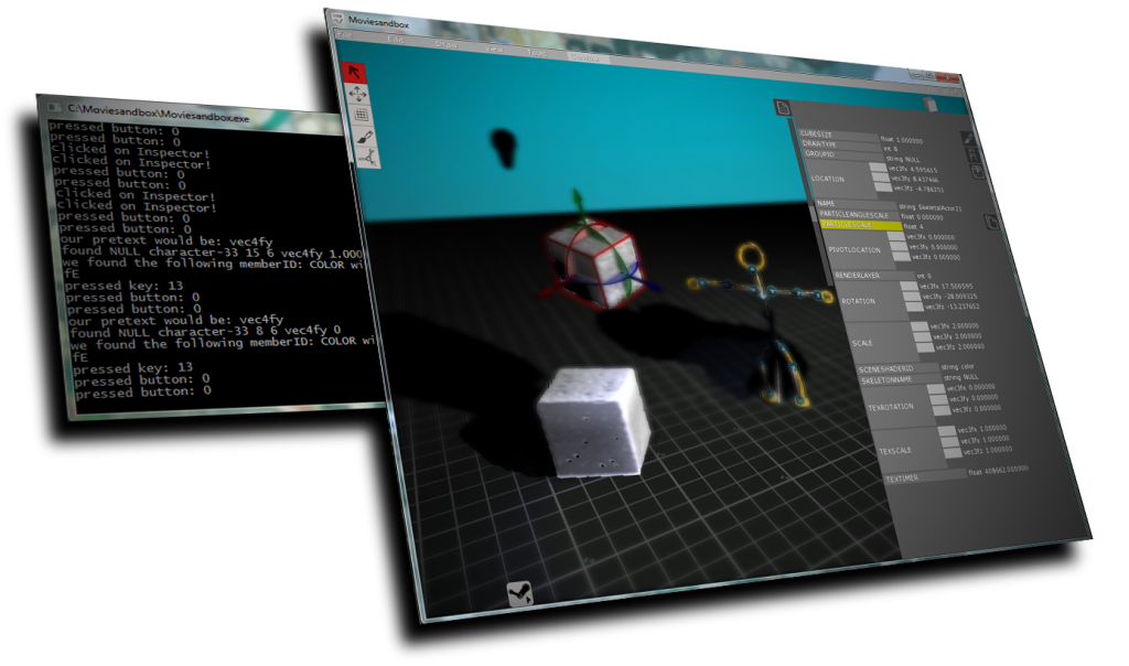
Before starting the video-tutorial filming process, I wanted to at least have the color scheme, grid texture and icons close to what it’ll be like in the 1.0 release. Here is a screenshot on what it looks like as of this morning:
(click to embiggen!)
There are still a couple of icons that need replacing, but I should be able to get the first video tutorial online tonight, which is exciting!
From tonight onwards, I also hope I’ll have a proper version number in the splash screen and in the “About” window, so that there’s no confusion as to which version you’re looking at (and giving feedback on).
Also: a big thank you to all of you who have been test-driving the nightly builds so far. Your feedback is super-valuable! Keep it coming!


