Verion post-mortem pt. 1
Verion was the first major project realised with the new Open-Source version of moviesandbox. It is a somewhere between 60 and 80 minute long live theatre performance with all sets and lots of characters projected in stereo behind two live performers.
In this post-mortem, I will talk about the 3D poduction aspect of the piece and try to provide some insight into what went wrong and what went right.
verion scene preview from Friedrich Kirschner on Vimeo.
some numbers:
Movie facts
Running Time: ca. 70 minutes.
Production time: May - September, a total of 4 months
3D production budget: 8000 EUR
3D production team size:
3 illustrators - Mika Satomi, Chris Glanz, Hannah Perner-Wilson
1 additional Programmer - Chris Sugrue
2 animation assistants - Bianca Bodmer, Stefan Bünning
and me - doing a little bit of everything
Assets:
9 main sets: watchtower, library, wall, city, room, cinema, nightmarket, alley, funfair
some are reused with some minor alterations.
8 digital characters: old man, old woman, gion, lauren-bikini, lauren-dress, lauren-jeans, swansa, peep
80 animations (approx.)
75 3D props (approx.)
1.6 GB of data - all stored in uncompressed xml
System
3.2 Ghz Intel Core2 Duo, running Windows Vista 32bit.
GeForce 8800GT with 512MB
4GB of main memory.
The process
Working with the script
We started production with a first version script that featured a lot more characters and a lot more detail - from a gang of serbian boys that cruises through the library on skateboards to lots of people in the nightmarket packing up in the early morning.
We agreed on going crazy in the script, with the idea that we would come up with creative ways to work around the obvious things, at the same time leaving enough space for the scriptwriters to give us ideas and come up with images that we could work from, without thinking of feasibility or technical issues.
Lots of amazing ideas for audience participation were tossed around in the first meeting, and I hope we will be able to revisit them at some point, with more money and time.
Alot of things had to be cut from the script, some significant elements even as close as two weeks before the premiere. It was one the most amazing experiences for me to work with a creative director who had enough understanding of the process and a good feeling of communication. Constant meetings were held discussing the state of the play and how realistic it was to implement all the aspects of the script. The meetings very very honest and void of ego.
I firmly believe that, given the time and the task at hand, this was the most important aspect of the production. If you cannot be honest about what you can achieve and you are not willing to cut and change and discuss all aspects of the production, you will not be able to concentrate, work together, and focus on delivering a finished piece.
Art Style
We met for the first time in March to discuss the project and the timeline, and then started actual production in May with a quick technical meeting followed by a "prototyping session" in Copenhagen with Anne-Catherine, the creative director. During this brief week, we implemented the stereo rendering and toyed around with art-styles.
Back then, the idea was to go with 2D billboards for the virtual characters, and photoshop filtered textures, very similar to the work I did in the Person2184 movies.
I didn't like that though. With "Ein kleines Puppenspiel", I had already started to work on a more particle-based approach to 3D and thought going back to billboards would be a step back.
Also: I now had a reasonably good engine that was able to push a good 2 Million point sprites and access to custom shaders, so i wanted to do something cool and new.
The decision to go for a completely particle-based look came very late. I was very worried that doing something completely new (for me, anyway) in such a short amount of time would add a hefty amount of extra work.
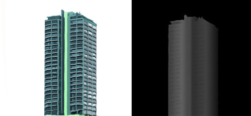
It turned out that it was quite the opposite. With the particle approach, we could make use of the milkscanner. Also, the way we produced props was basically the same as with the billboard approach - just now we converted them to particles and had to paint displacement maps.
Here's an example of a building created like this:

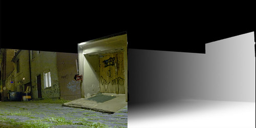
It's a very fast way of producing content - at least for a theatre piece with limited camera movement. Youcan go very far with this method. There's even a set piece that is created out of a single image:

While it is a fast way of producing content, it became clear that it won't be fast enough to create compelling sets for all the scenes, and that at some point, with the stereo rendering and all, we would be hitting limitations.
Obviously, things start to become slow at around 3 Million particles. Also, while it's great to create small props, things like terrain would be horrible to do this way - in terms of performance.
So we decided to add some more graphical aspects to the set design, to create balanced and interesting images on stage. They also give a way of balancing color and tone of each set piece and add a sense of abstraction, which helps blend in the live-actors with the world.
The switch towards the graphical elements came quite late though, and some scenes suffer from a lack clear color direction and too concrete and overcrowded set design. In general, the later the sets were built, the better they look.
Next time: Character Design, Animation and Scripting


1 Comments:
Very interesting work. I'm looking forward to your next posts about the project. Especially I would like to know more about the theatrical parts of this piece, e.g. the stage architecture and the interaction between real and virtual actors. Is there any chance to see the live performance in the next months? Cheers, Dirk
Post a Comment
Links to this post:
Create a Link
<< Home